StudySync

English Language Arts Curriculum

StudySync is a comprehensive ELA curriculum for grades 6–12 that combines rigorous content with a digital-first learning experience. Its library of texts, multimedia, assessments, and collaborative tools gives teachers flexibility while creating engaging ways for students to read, write, discuss, and learn.

I contribute to StudySync across both hands-on design and product leadership. I shape user experiences and front-end implementations while guiding product direction, design strategy, and cross-functional collaboration. This combination of hands-on craft and strategic leadership helps create a more cohesive experience for educators and students.

Design & Front-end Strategy Design Systems Accessibility
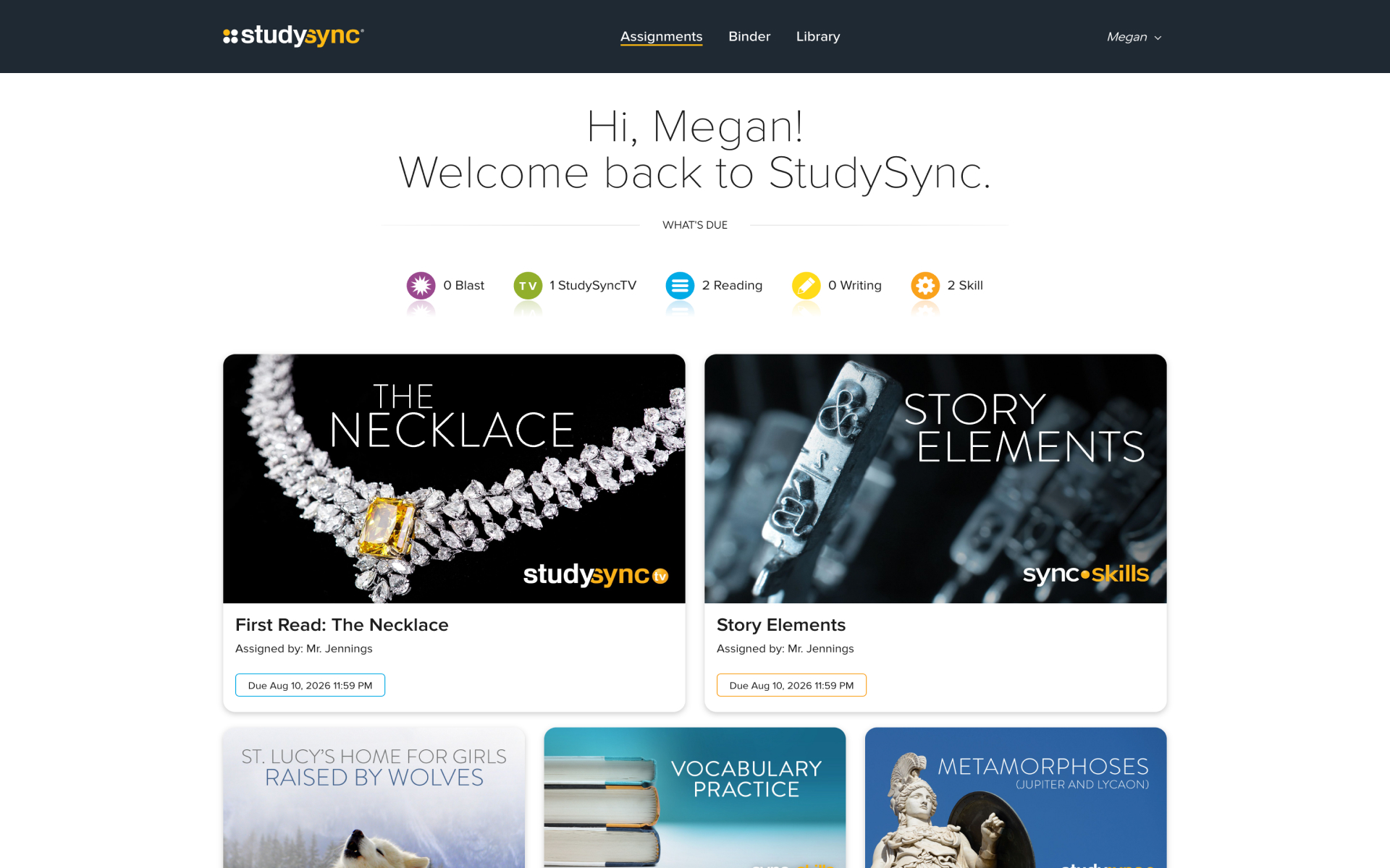
Student Assignments
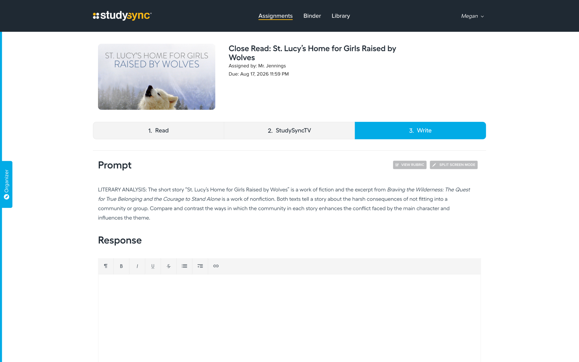
Student Assignment Write
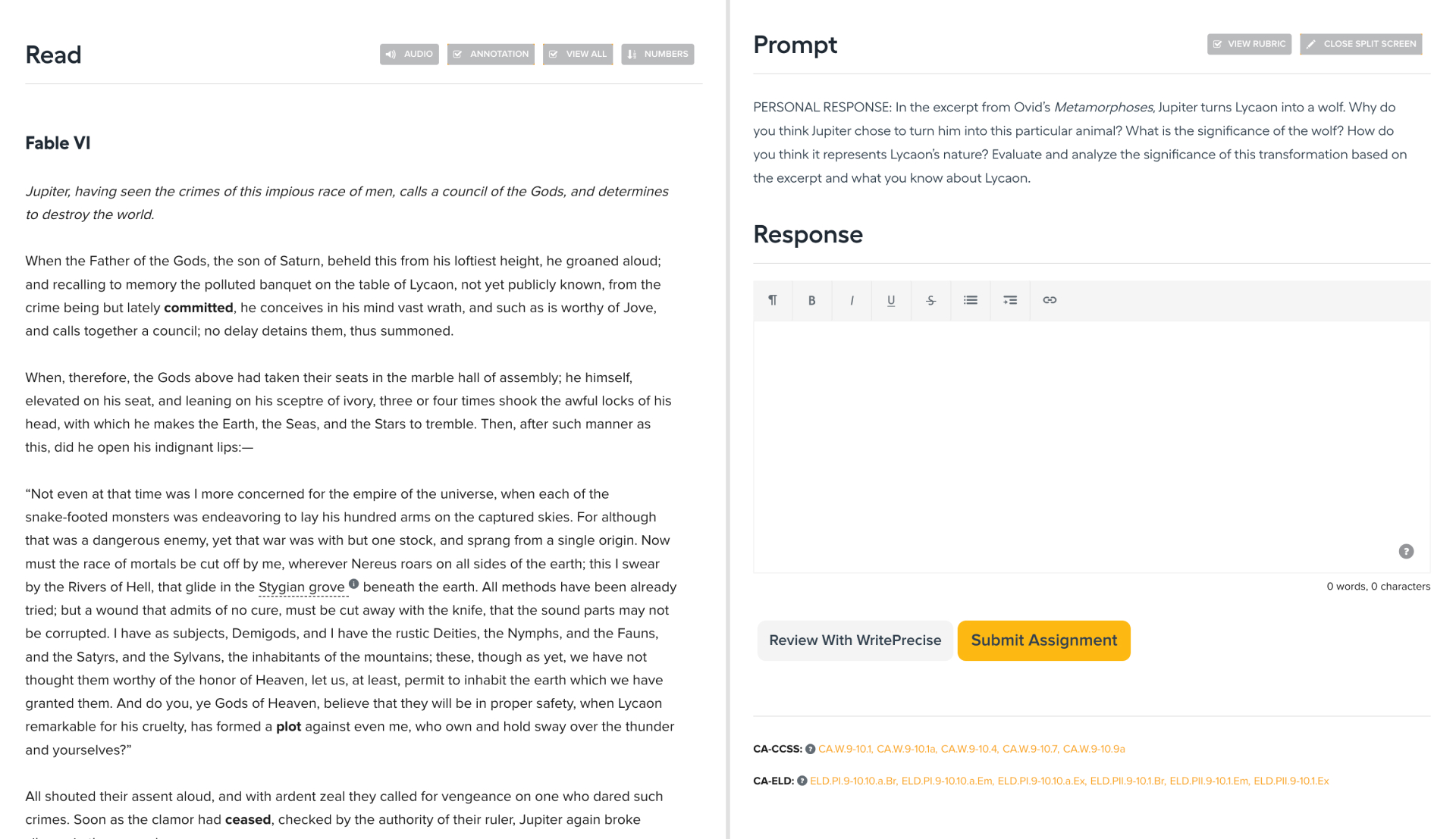
Student Assignment Splitscreen
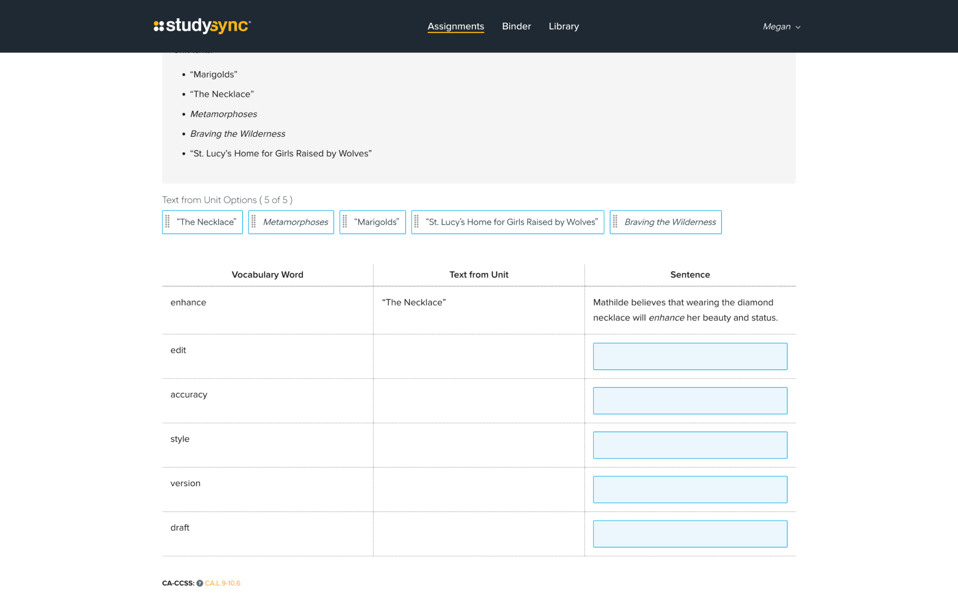
Student Assignment Your Turn
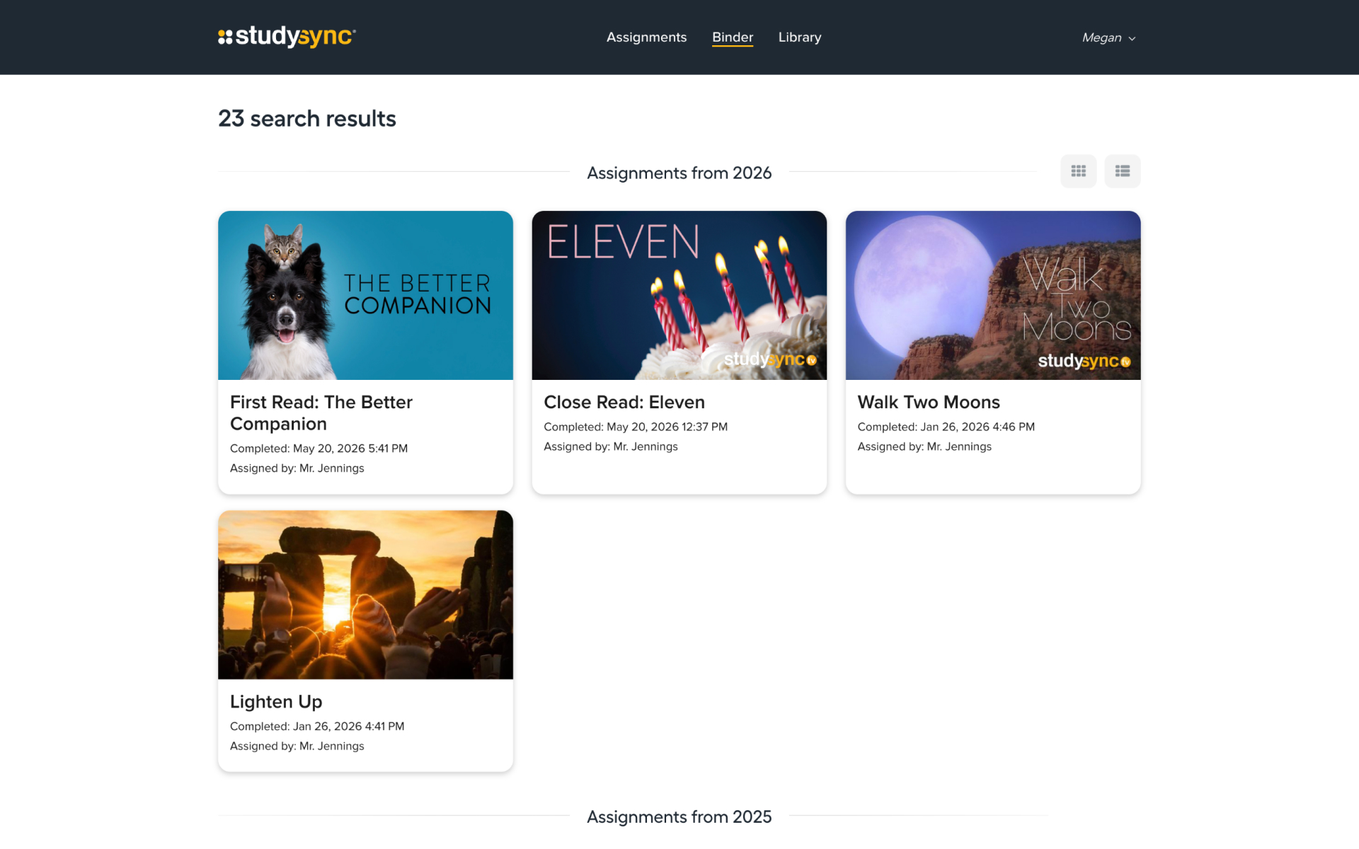
Student Binder

Student Interface

The student experience centers on the Assignments page, where tasks requiring action are presented in card format. Completed tasks seamlessly transition to the Binder, where students can access or export previously finished work. Within an assignment or assessment, content is organized into predefined sections, with the number and structure adapting based on teacher customizations.

Designing for grades 6–12 meant creating an experience that could support a wide range of ages and abilities within a shared interface. We focused on clear hierarchy and straightforward interactions that helped students understand what they needed to do while keeping the experience flexible enough to accommodate different types of assignments and assessments.

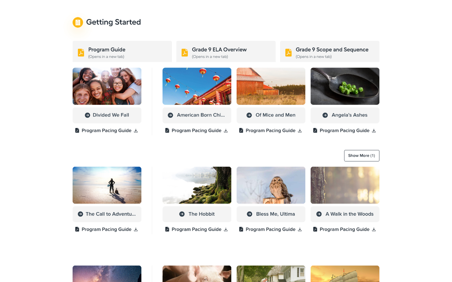
Teacher Homepage
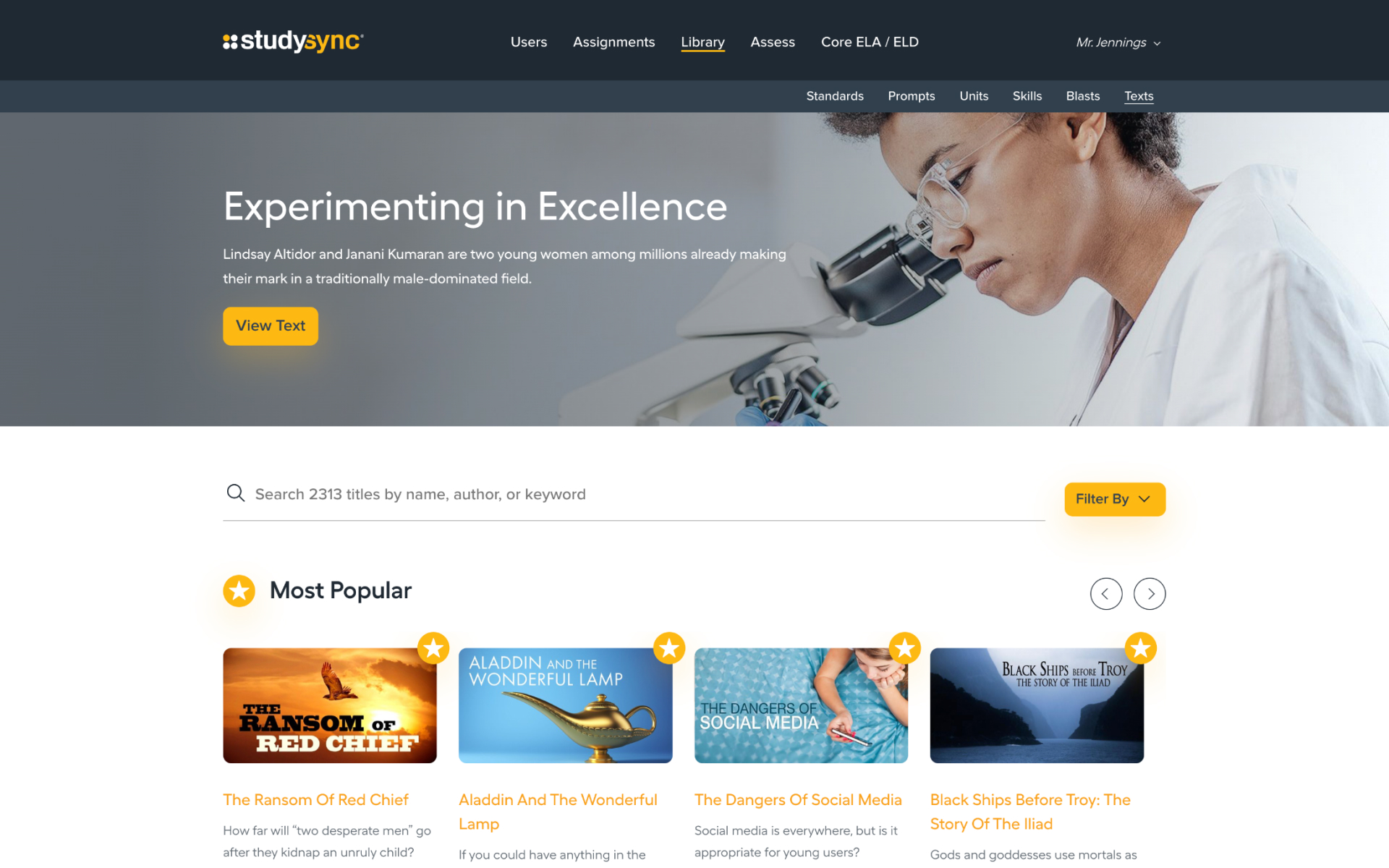
Teacher Library
Teacher Core Grade 9
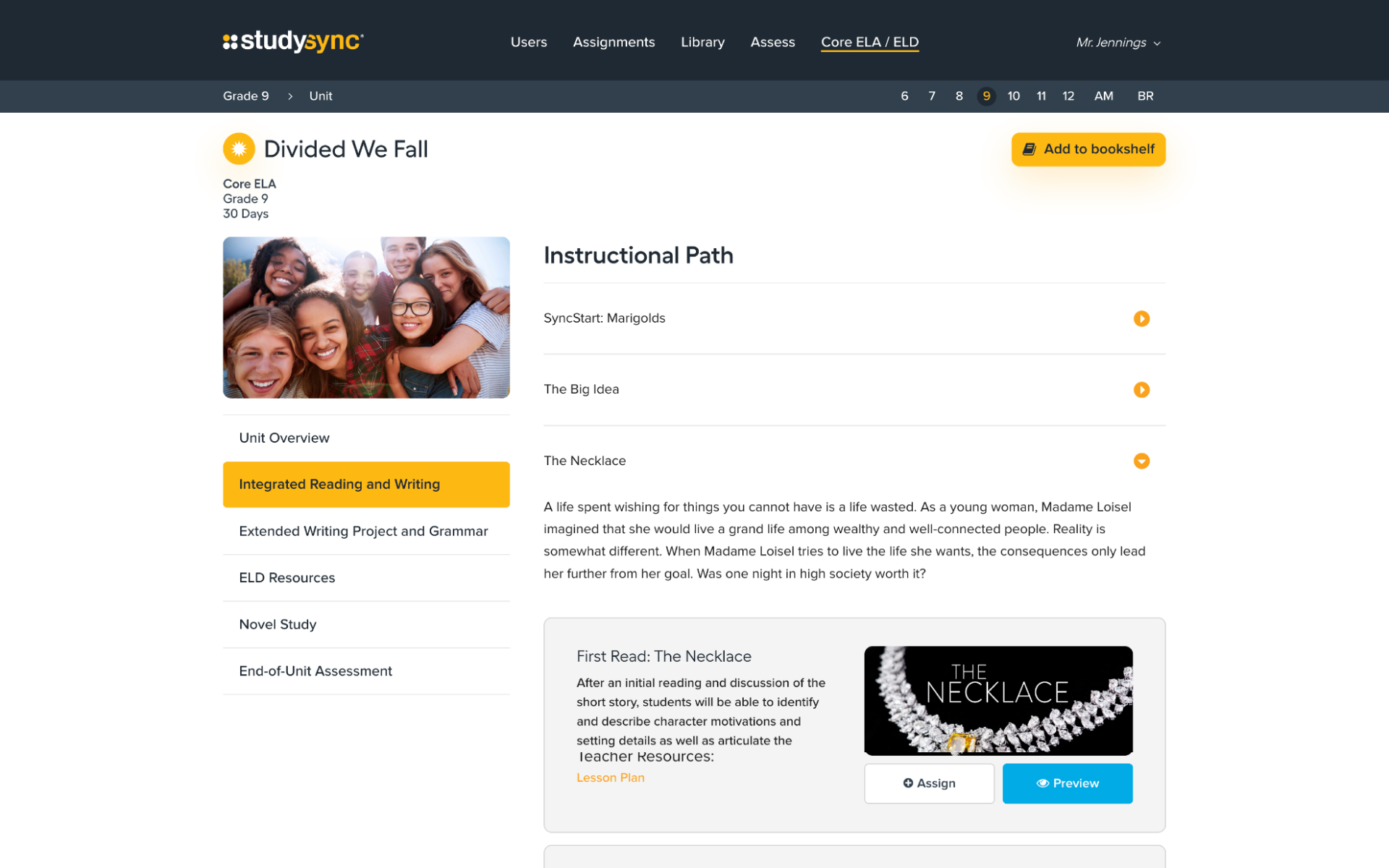
Teacher Unit Path
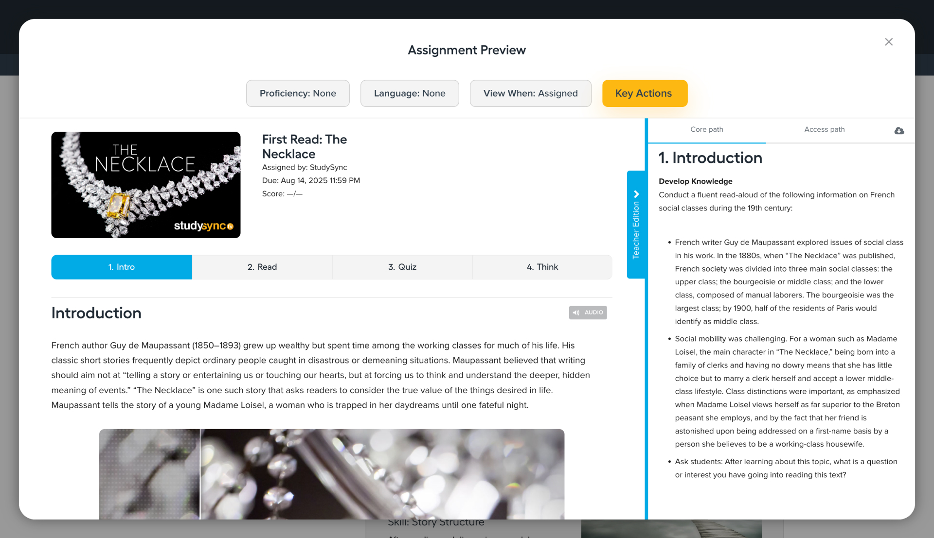
Teacher Assignment Preview

Teacher Interface

The teacher interface was nearly twice as extensive as the student interface, encompassing everything available to students alongside additional features and tools designed specifically for educators. The experience brought together the functionality teachers needed to manage assignments, assessments, content, and student progress within a single environment.

With such a broad range of functionality, one of the primary design challenges was maintaining a clear and approachable experience without limiting the depth of tools available to teachers. We organized the interface around distinct workflows and consistent patterns, helping educators move between managing their classroom, delivering instruction, and reviewing student work.

See It in Action

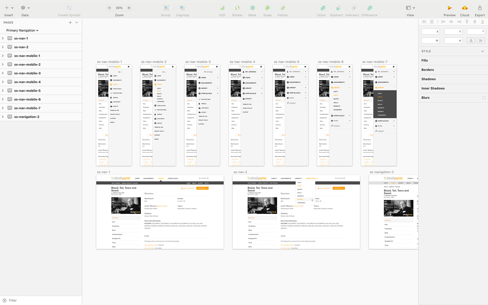
Primary Navigation Mockup Explorations
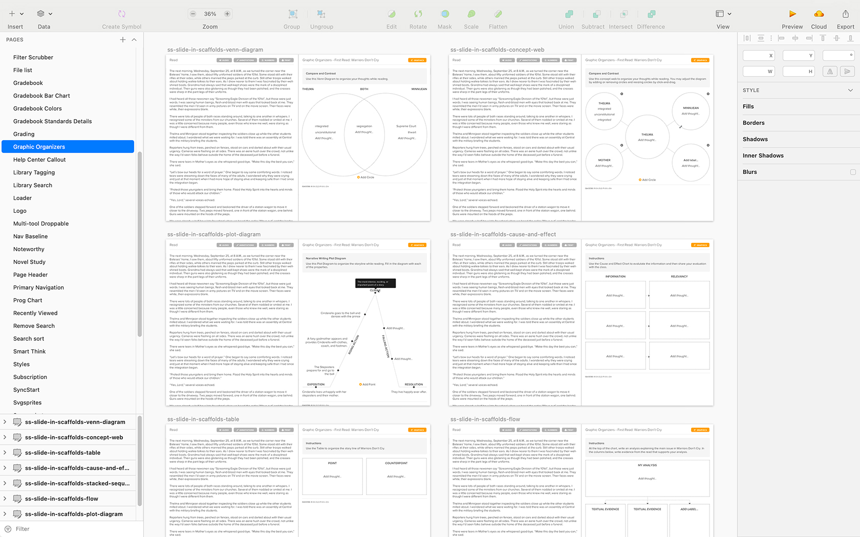
Graphic Organizer Mockup Explorations
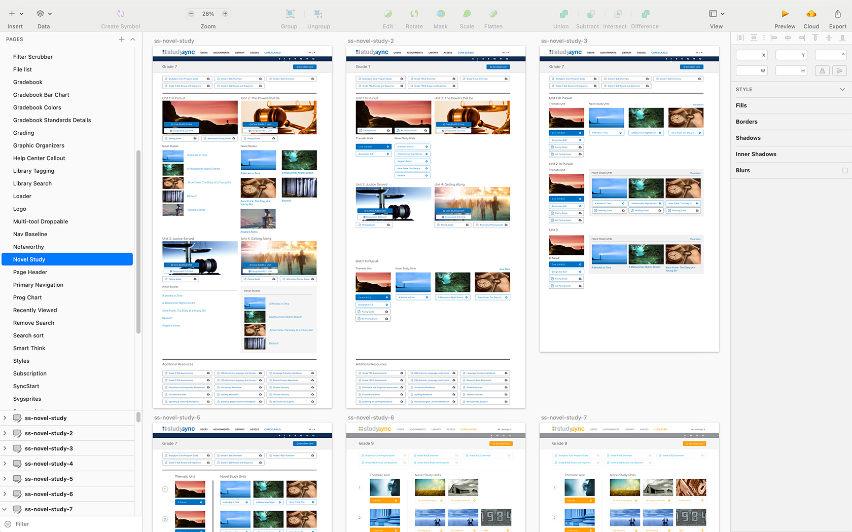
Novel Study Units Mockup Explorations
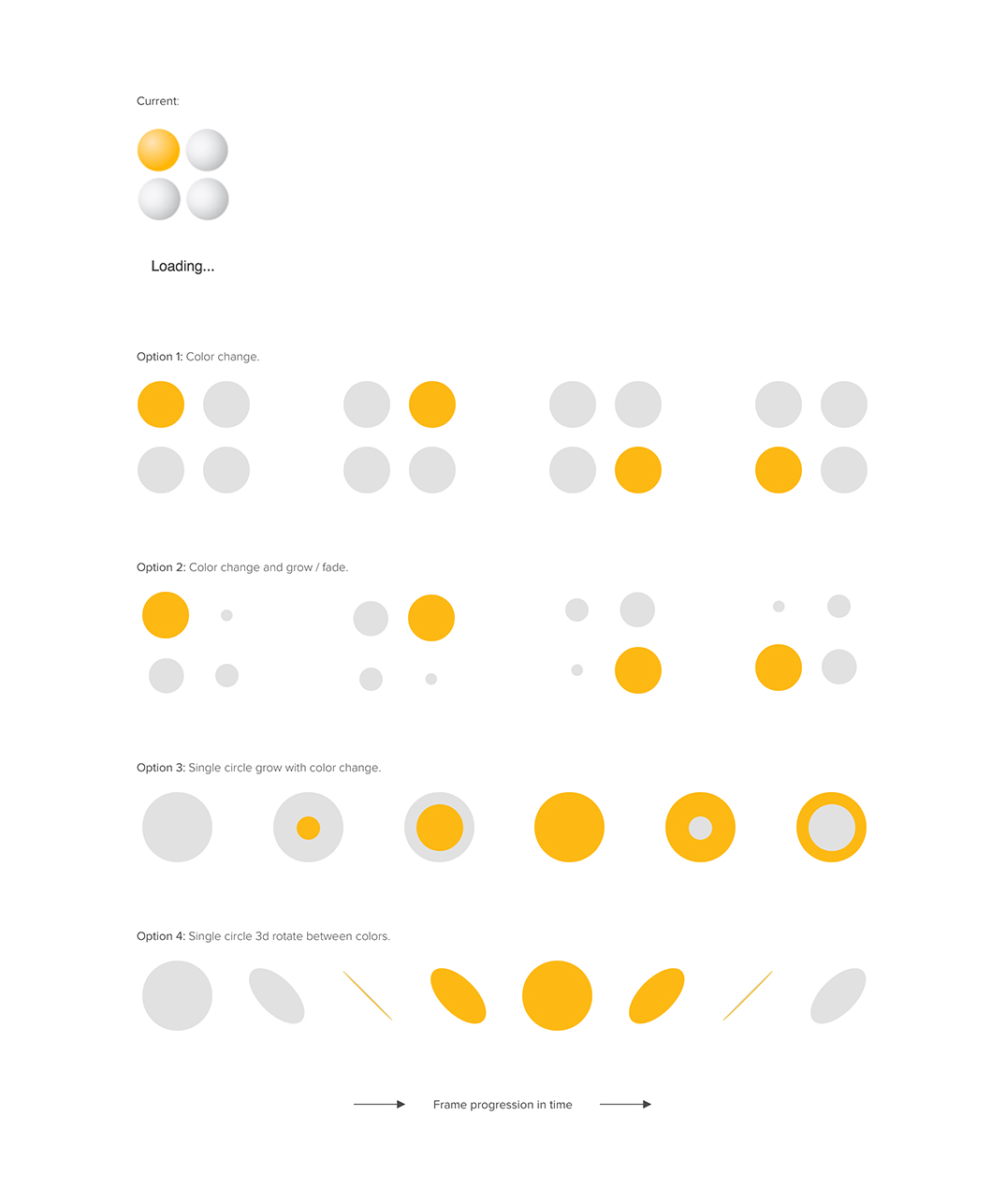
Page Loader Mockup Explorations
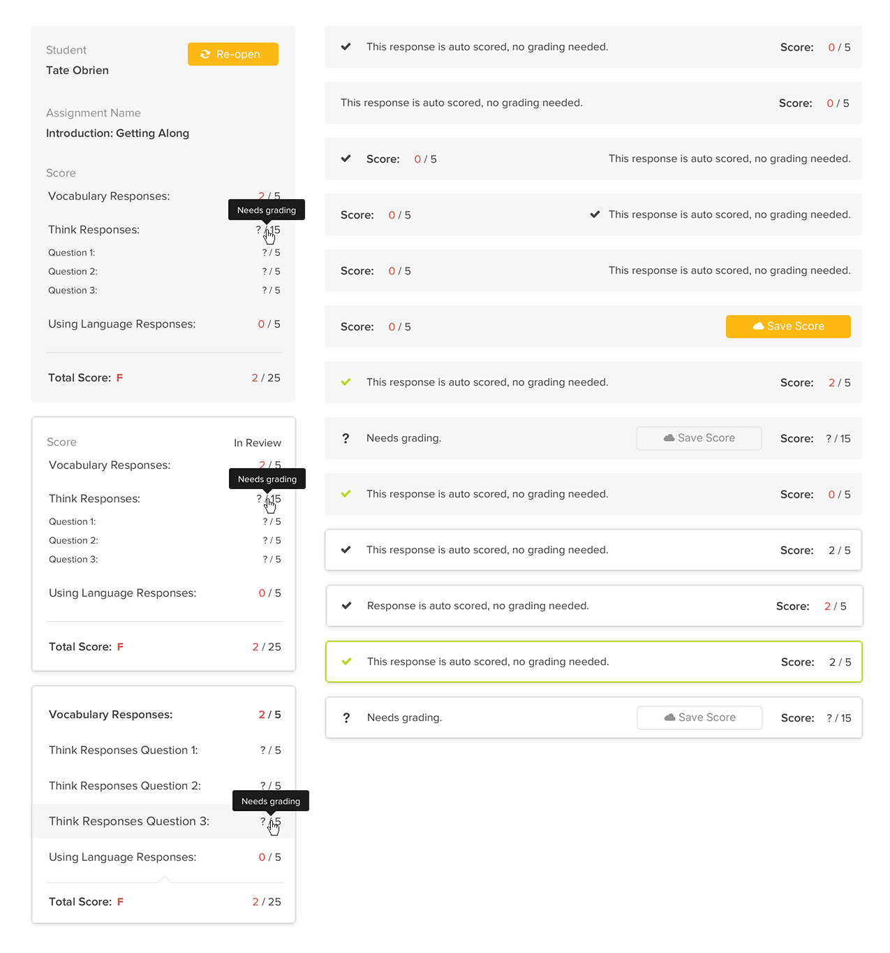
Score Feedback Mockup Explorations

Prototyping

We primarily used mockups to explore ideas and provide blueprints for development. For features with distant deadlines or larger assumptions to explore, I would pre-design the experience. When developers were already working on a feature, I would refine the experience afterward. We trusted our developers to make UX decisions along the way, often taking a “throw clay on the table” approach that allowed our small team to keep ideas moving quickly.

As development progressed, some designs evolved directly in the browser rather than being reflected back in the mockups. We intentionally avoided treating mockups as the final product, allowing the level of design fidelity to vary based on where a feature was in the development cycle. This approach helped us focus design effort where it added the most value while keeping the team moving forward.

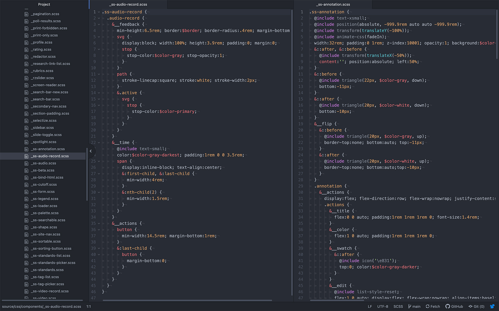
Code Example

Front-end Development

StudySync's front-end was constantly evolving as new technologies and standards emerged. As a designer who also contributed to the codebase, I was able to consider implementation alongside the design process, leading to simpler solutions and a closer connection between the intended experience and what was ultimately built.

Working directly in the code also created a shared language between design and development. Understanding the technical considerations behind an experience made it easier to collaborate with developers, identify practical solutions, and make informed design decisions throughout the product development process.

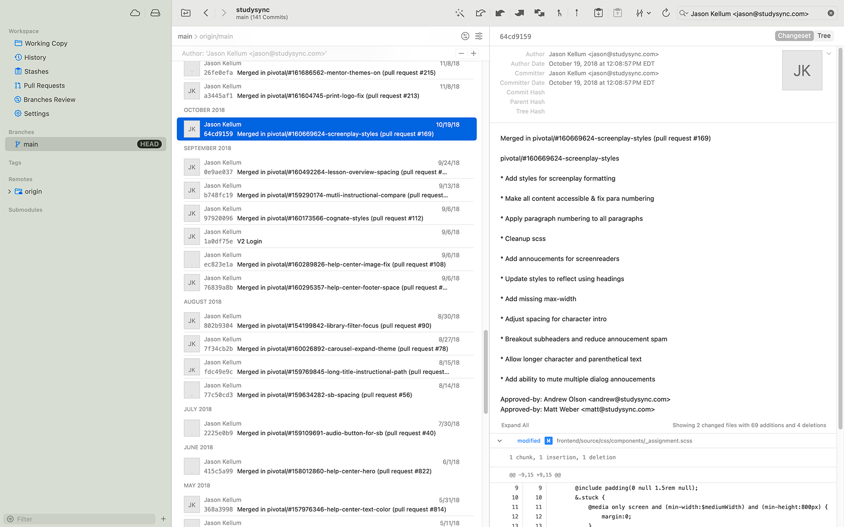
Tower Version Manager using Pivotal IDs

Project Management

Throughout the development cycle, we experimented with different approaches to managing and organizing the work before establishing a process that fit our team's needs. The goal was to make it easier to organize, prioritize, and assign work while keeping the connection between design, development, and the original product requirements clear.

We also established conventions that made work easier to track throughout development and review. By connecting development branches and pull requests back to their originating tasks, we created greater visibility into the work and made collaboration and review more efficient.

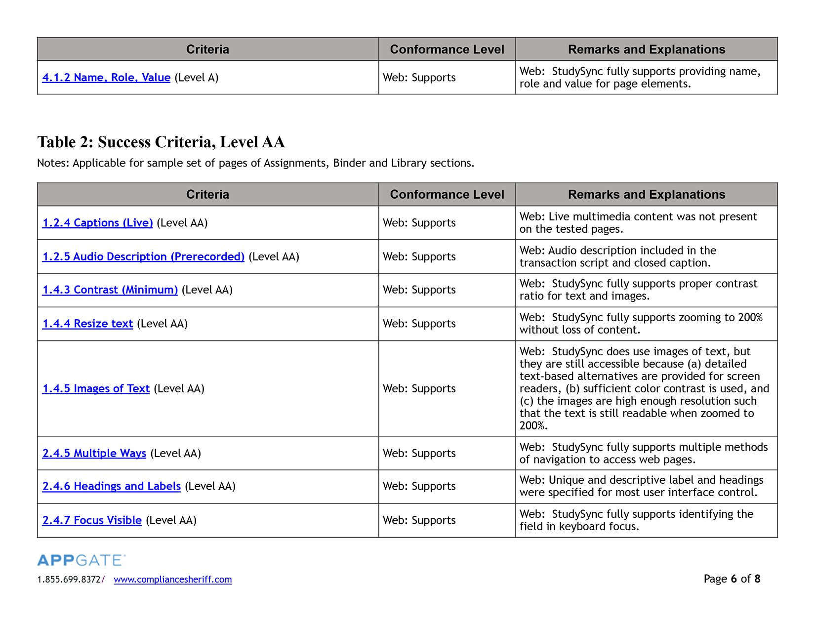
StudySync VPAT Excerpt
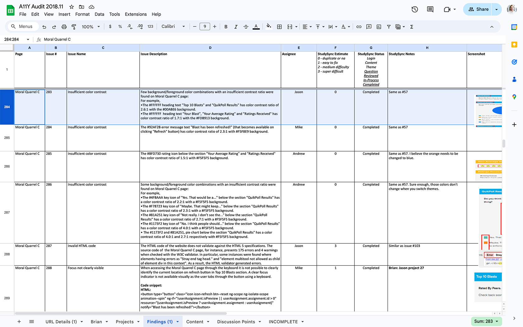
A11y Issues Spreadsheet
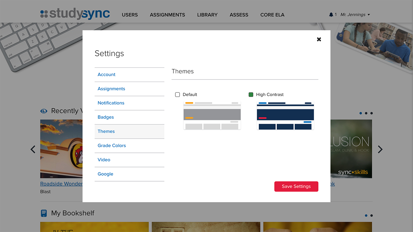
StudySync Themes

Accessibility

Our team initiated a company-wide effort to bring systems and content into compliance with WCAG 2.0 accessibility standards. We partnered with a third-party auditor to identify and categorize accessibility issues, then worked through the findings to implement appropriate solutions across the product.

The initiative went beyond meeting accessibility requirements. It helped establish a stronger understanding of accessibility best practices across the team, influencing how we approached systems and content moving forward. As a result, we achieved a VPAT (Voluntary Product Accessibility Template), enabling StudySync to meet the accessibility requirements of school districts and qualify for contracts where those standards were required.

SyncBlasts as a Product

SyncBlasts provides reading and writing assignments built around social studies, science, and current events relevant to students’ lives and the world around them. The product grew from a successful feature within StudySync, with content shared across both platforms to maintain consistency and relevance.

My role was to reimagine the experience without altering the structural foundation of the content. I modernized the layout, established an independent visual identity, and emphasized the timely, newsworthy nature of the material. The result was a distinct product experience that gave the content a stronger identity while preserving the underlying learning model.

See It in Action